Saturday, March 20, 2010

The Amazing Race through the Arts: From Plock, Poland to Gera, Germany, to Takaoka, Japan

The Foundation for Arts and Music in Education of the Wabash area will host its fourth annual FAME Festival on March 27, 2010. The festival will take place at the Honeywell Center in Wabash, Indiana.


The FAME foundation was founded in 1987 to foster and perpetuate creativity through multicultural arts education.
The theme this year is centered around the countries of Poland, Germany, and Japan, each having a sister city to Fort Wayne, Indiana.


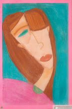
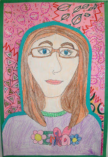
The 2nd 9 weeks group of fourth graders each made a poster representing the FAME festival's theme. Each poster refers to Poland, Germany, and Japan in some way.


One of the Blair Pointe submissions will be made into a professionally printed poster which will be used around Peru to publicize the FAME Festival.


For more details about the Foundation for Art and Music in Education, or the FAME Festival, please visit their website: http://www.famearts.org/ .


Friday, March 19, 2010

American Gothid Redux


Surely you recognize this famous American painting...


American Gothic by Grant Wood


But you may not be as familiar with these masterpieces...


During the second 9 weeks, the 4th graders studied Grant Wood's American Gothic. They also learned the word, "PARODY."


A "parody" is a picture that imitates an artist's style, or a famous artwork. The intention is to create humor, or to ridicule.


These parodies of American Gothic create quite a bit of humor, wouldn't you say?


Friday, October 30, 2009

STARRY, STARRY NIGHT

In a letter to his sister Wilhelmina, Vincent Van Gogh said "At present I absolutely want to paint a starry sky. It often seems to me that night is still more richly coloured than the day; having hues of the most intense violets, blues and greens. If only you pay attention to it you will see that certain stars are lemon-yellow, others pink or a green, blue and forget-me-not brilliance. And without my expatiating on this theme it is obvious that putting little white dots on the blue-black is not enough to paint a starry sky."
"Vincent van Gogh painted Starry Night. It later was famous." -Onyx
We studied the life and artistic style of Vincent van Gogh. Then we created our own version of Starry Night using oil pastels.
"We learned a lot about Vincent van Gogh, and how he used little brush strokes." -Jellybean8

"Vincent van Gogh's Starry Night was very hard because we had to use short brush strokes. It was very fun, though." -Kailyn

"It was fun using oil pastels because you can actually mix them, unlike crayons." -DonutDude
"Making the Starry Night was hard, but it was fun and it looks nice. My favorite part was the sky because blue is my favorite color." -Dylan
"It was fun mixing the colors like vanGogh. The colors I liked to mix were blues and greens." -ManofRobots
"I think it was fun and my favorite part was making the sky because I got to use blue." -bigsquishy
"It was so much fun making this project because Starry Night is my favorite piece of artwork." -Blaze
"My parents loved my Starry Night. I love it too!" -Sapphire

Artwork shown was created by: Betheny, Braxton, Braxton, Bryanna, Garrett, Haley, Hunter, Sean


Thursday, September 17, 2009

Into the Looking Glass...

I think your whole life shows in your face and you should be proud of that. ~Lauren Bacall

"A portrait is a picture of anybody. A self-portrait is a picture of yourself." -DonutDude

We looked very carefully in a mirror and created a portrait of ourselves...a SELF-PORTRAIT.
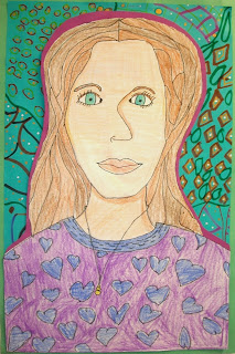
"First we made our self-portrait: eyes, nose, mouth, ears, hair. Then we cut it out, put it on the colored paper, cut it out, then put the 3D o's on the back, then put it on the pattern sheet." -Hunter

We created PATTERN on our background...

" A pattern is a thing repeated again and again." -Sarah
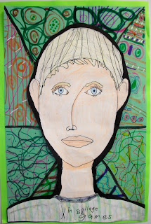
"I used pattern in my background which has peace signs everywhere and hearts a lot. It makes my project a lot better." -Kailyn

"I have gold spots on my project and I have silver eye balls. I Have zigzags on my project, too." -Austin
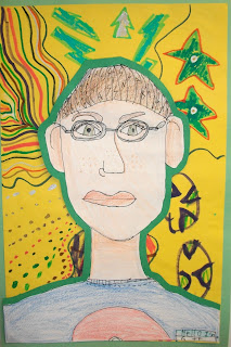
And we learned about the ELEMENTS of art along the way...

"In my shirt I used curved, straight, and ragged LINES. In my hair I used ragged LINES. And in my glasses I used straight and curved LINES." -P.Money

"I have used LINE in my hair- jagged, and shirt- repeated and curvy." -BigSquishy
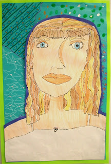
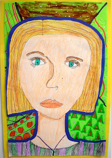
"We used ovals for the eyes, head, shirt, and lips (SHAPE)." -Shamrock
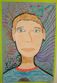
"I use the element of COLOR by blending gold and brown to make my hair." -Branson

"My shirt is a primary COLOR and two secondary COLORS." -Seth

Reflections on our artwork...
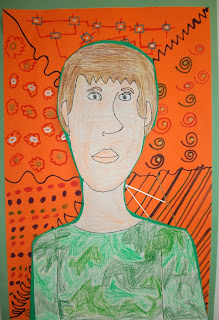
"I am proud that I could work on this and get it done without giving up." -Haley

"I would title mine Look-A-Like. I would name it that because it looks just like me." -Choclates

"I learned that you need to be nice and careful." -Kayla
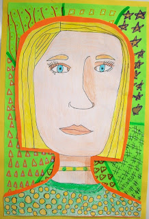
"The easiest thing to do on the project was the nose." -Bob
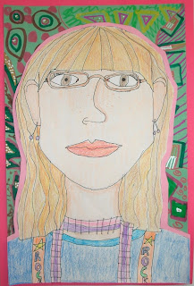
"I think the hair was the most difficult thing to do because it had a lot of lines and squiggles." -MaxPitts44

"I think people will like my project because it looks like me." -Sapphire

"I think my biggest challenge was making my eyes look perfect and the same I don't know why, but it was." -RallyCat

"I don't mean to brag, but I think I did great on it because the background didn't distract you from the portrait." -Blaze

When I take it home, "I will go to my room and hang it up on my wall." -Dimond


Artwork shown was created by:
Erika, Haley, Braxton, Sean, Blaze, RallyCat, WildChild, Gwen, BigSquishy, Branson, Bob, JellyBean8, & Choclates

Thursday, August 27, 2009

A PARODY ON MONA LISA


You know this lady, right?
Mona Lisa, by Leonar
do daVinci.

We learned what a PARODY is first:
"A parody is a copy of something that you add to or take away from." -Jeremiah

"It's something that you change to make funny." -Ariana

Then we created a parody with Mona Lisa as the subject:

"First we chose our background and glued it on. Then we glued on Mona Lisa and accessories." -WildChild

We learned about the Elements of Art along the way:
"In mine, the tornado has curved LINES." -Jordan

"Well, my project is absolutely flat and it has bumps from glue." (TEXTURE) -C

"I used the element of COLOR by using orange, red, green, brown, black, silver, yellow, and white." -Bryanna

"Mona Lisa feels really smooth and when we put the pieces of magazines on it feels really different. More smooth, though."(TEXTURE) -RallyCat

Reflections on our projects:
"I am very proud of my artwork because it is pretty to me. I think it is funny." -Choclates

"My favorite part is the background because it is very bright and beautiful." -Kayla

"The easiest thing was to glue and cut the things out of magazines..." -Madison

"I am very, very proud of my artwork, though it may be a little crazy." -Sapphire

"I will take it to my house and stick it on our fridge." -BigSquishy

"My hardest challenge was finding a background." -Natalie

"I did not know that daVinci painted Mona Lisa." -Jacob


Artwork shown was created by:
Ethan, Kailyn, Bailey, Blaze, & Kayla

Thursday, July 16, 2009

Coming soon...

School starts for us on August 14th. Check back about a week later to see what we create in Art class the first week of school! See you then!